Logo Design / Brand Design Oughterard Galway Ireland
The Brief: Give the Village a Visual Identity
Oughterard, a well-known village on the edge of Connemara, wanted a logo that reflected its landscape, heritage, and lifestyle. With tourism growing and local initiatives expanding, the community needed a town logo design that could unify everything — from signage and print materials to digital campaigns and local merchandise.
As one of the most experienced logo designers in Galway, we were brought in to deliver a visual identity that was both practical and specific to place.
The Process: Clear Thinking, Straightforward Execution
At Designwest, we don’t jump straight into design — we start with purpose. Oughterard’s committee completed our brand identity questionnaire, and we gathered direct insights into what mattered most:
- Include sky blue in the colour palette
- Showcase visual landmarks: the stone bridge and tower
- Reference popular outdoor activities like cycling, golf, and fishing
- Keep the design clean, functional, and easy to reproduce
That’s how we approach every logo design Galway project: not with assumptions, but with structure, clarity, and strong client input.
Step-by-Step: From Concept to Final Logo
1. Discovery
We researched other town logo design examples in Ireland. Many fell into the trap of being either too abstract or too overloaded. Our approach was to simplify while keeping detail where it counted.
2. Concept Development
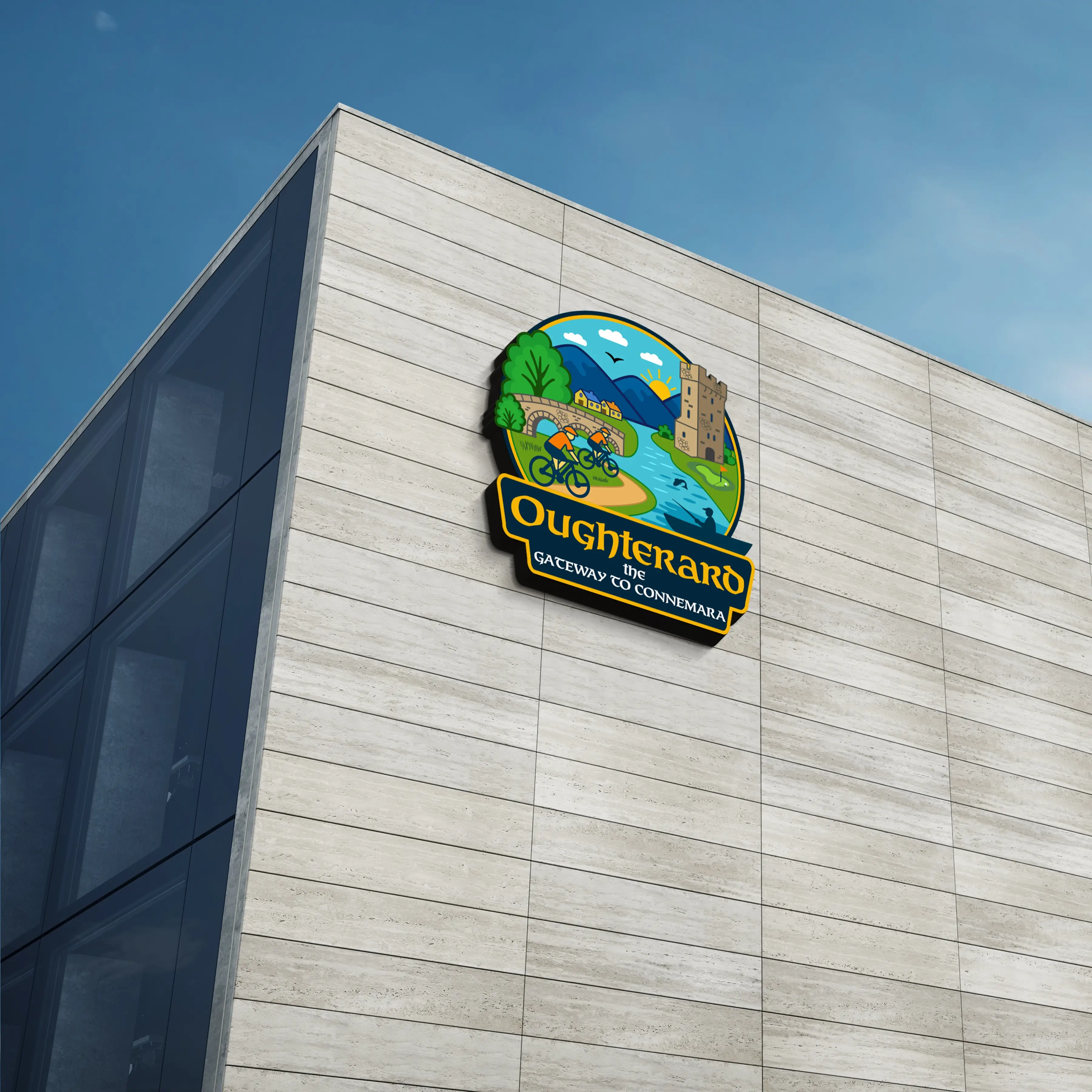
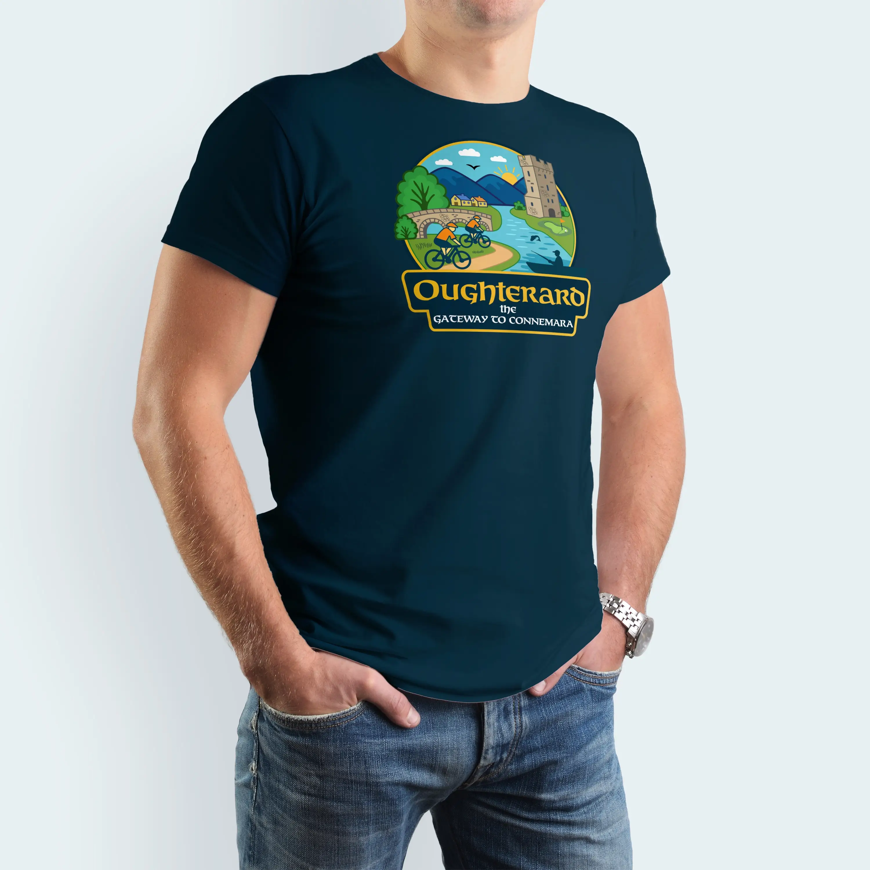
We explored several visual directions. The bridge formed the centrepiece. The cyclists brought movement. The tower added structure and story. The salmon, rising up through the water, echoed local fishing life and brought energy into the composition.
Each element was placed with intention, drawn to balance — not excess.
3. Colour and Type
Sky blue became the base colour, complemented by greens, ochres, and slate greys — all drawn from the surrounding landscape.
The typography was designed to be readable, professional, and slightly traditional. This logo had to sit equally well on signage at the town entrance and on printed leaflets in a tourist’s hand.
The Final Design: What It Captures
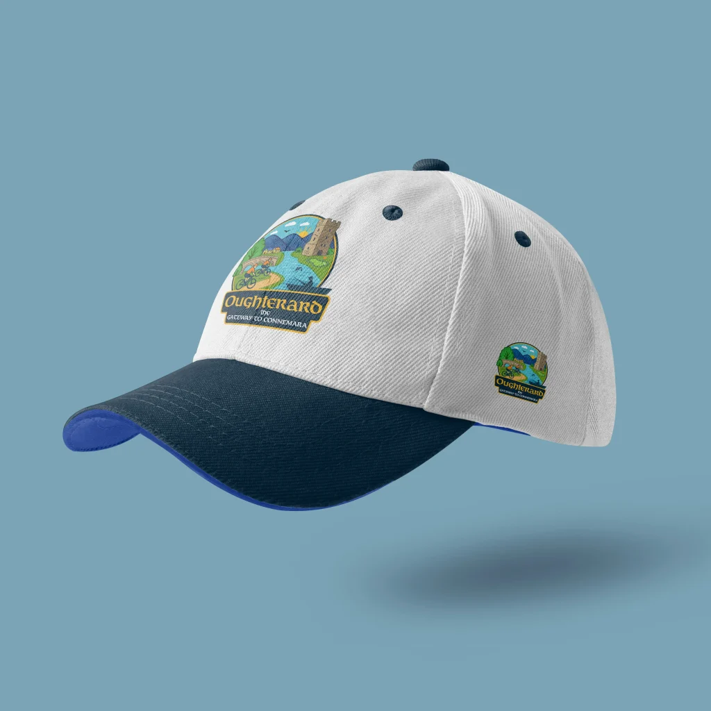
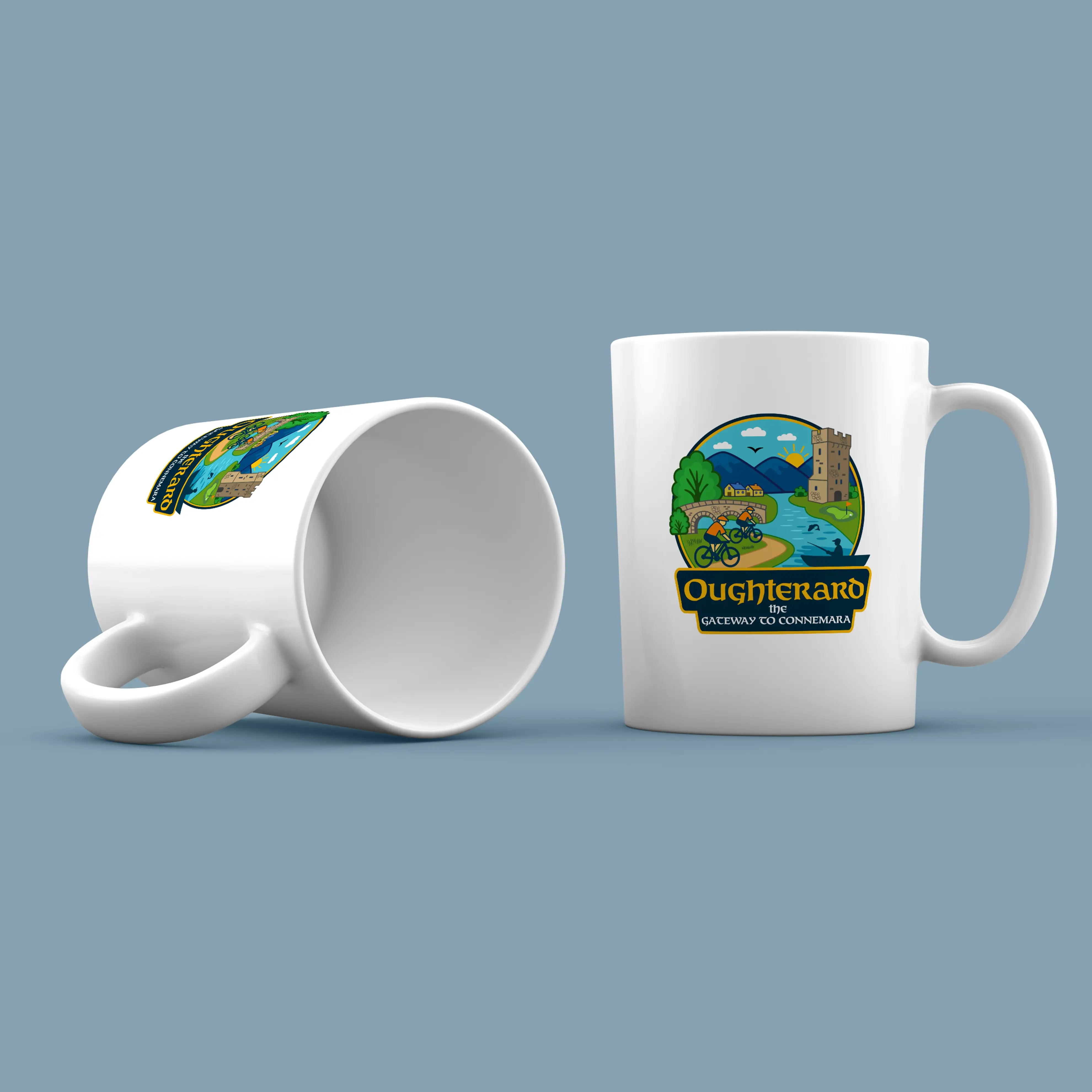
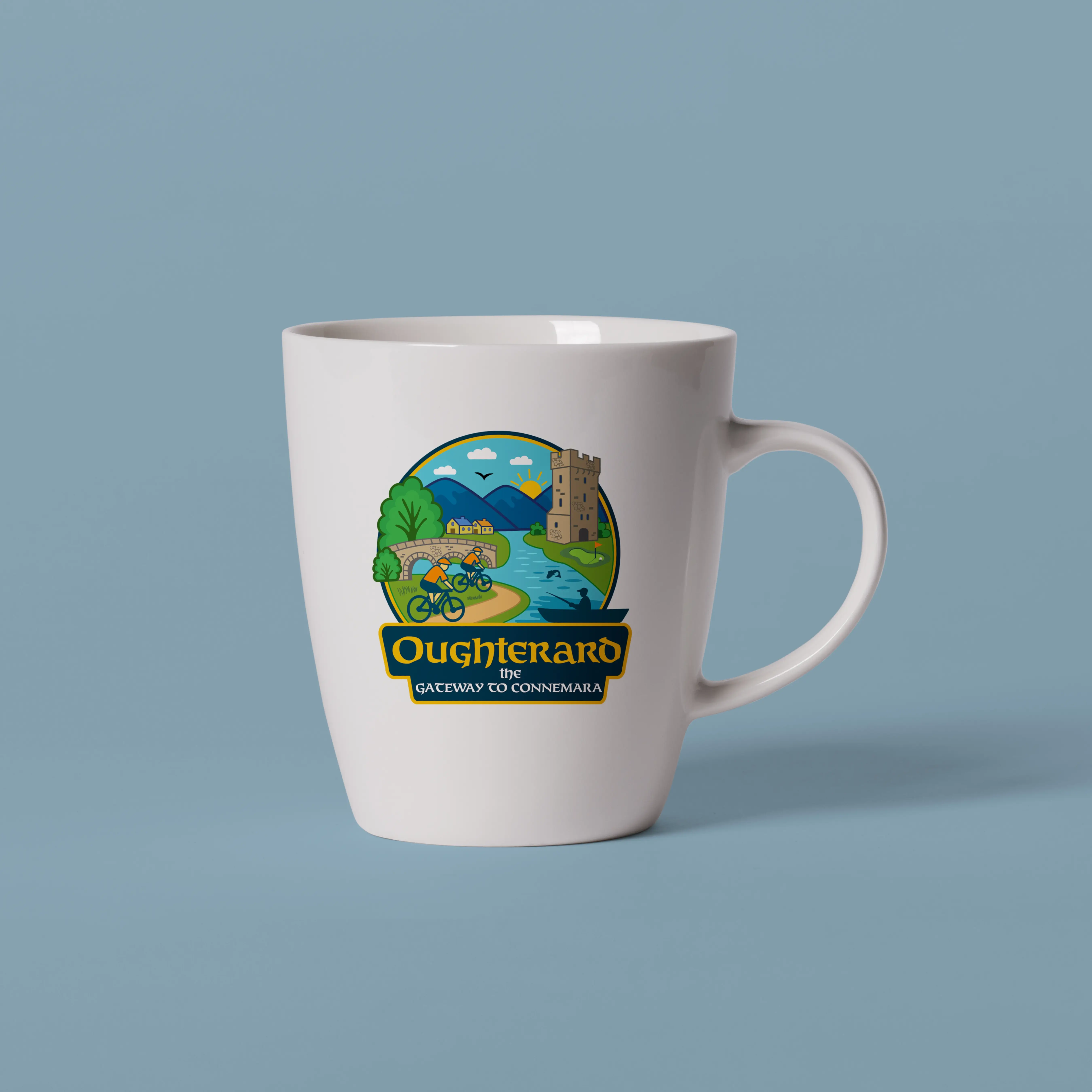
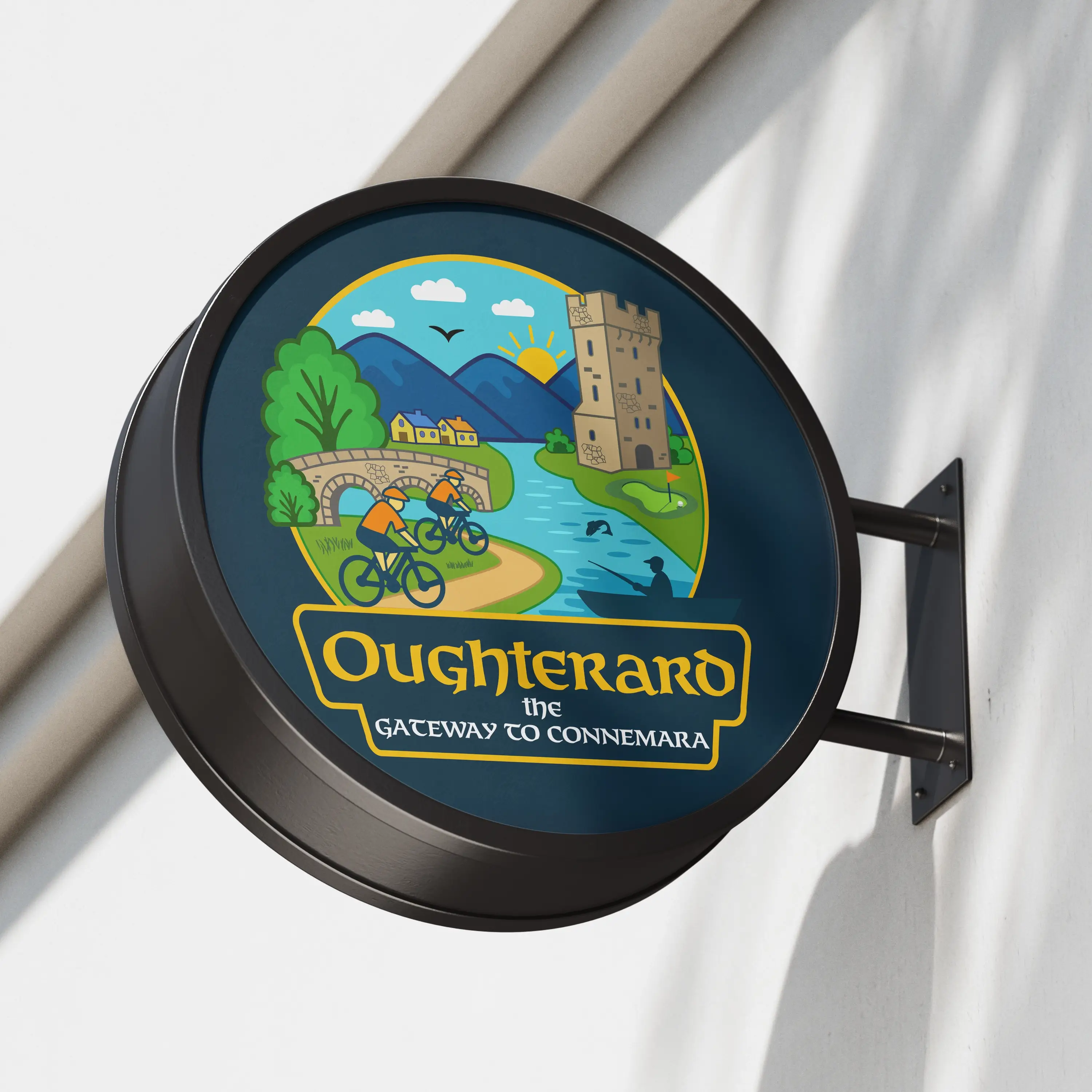
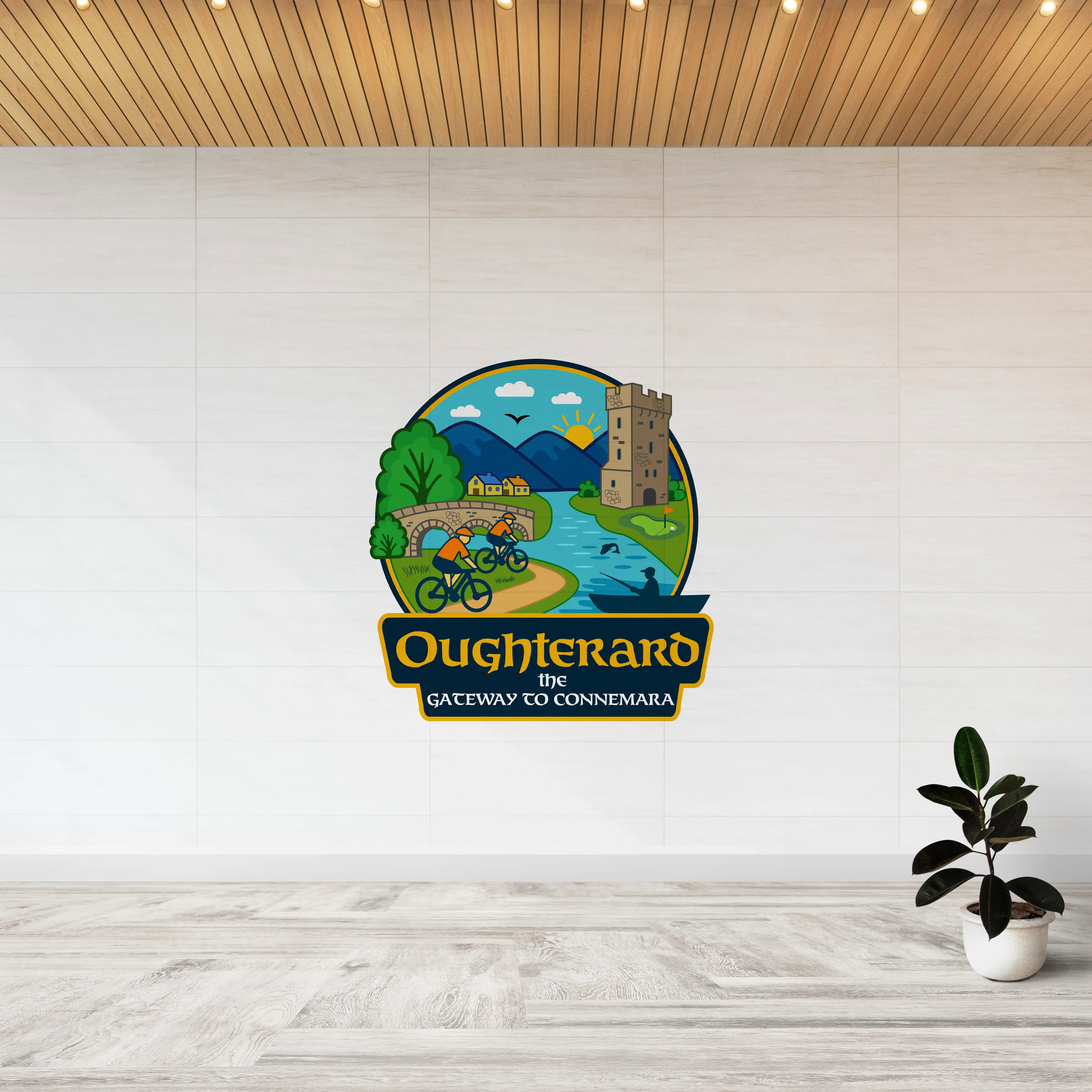
- Cyclists on a trail – referencing Oughterard’s cycling and walking routes
- Stone bridge – central to the town’s identity
- Watchtower – a nod to local heritage
- Fisherman and salmon – paying tribute to the Corrib’s angling reputation
- Golf green – a subtle but relevant detail for local leisure
- Sun over hills – situating the village within the Connemara landscape
This isn’t an abstract mark. It’s a layered visual that tells a story, backed by strategy and community input — exactly what good town logo design should do.
Why This Logo Design Works
- Built for real use – signage, social media, print, uniforms, and more
- Locally relevant – every part of the composition comes from Oughterard
- Scalable – works in colour, black and white, small sizes, and large displays
- Distinct – not interchangeable with any other Irish town or region
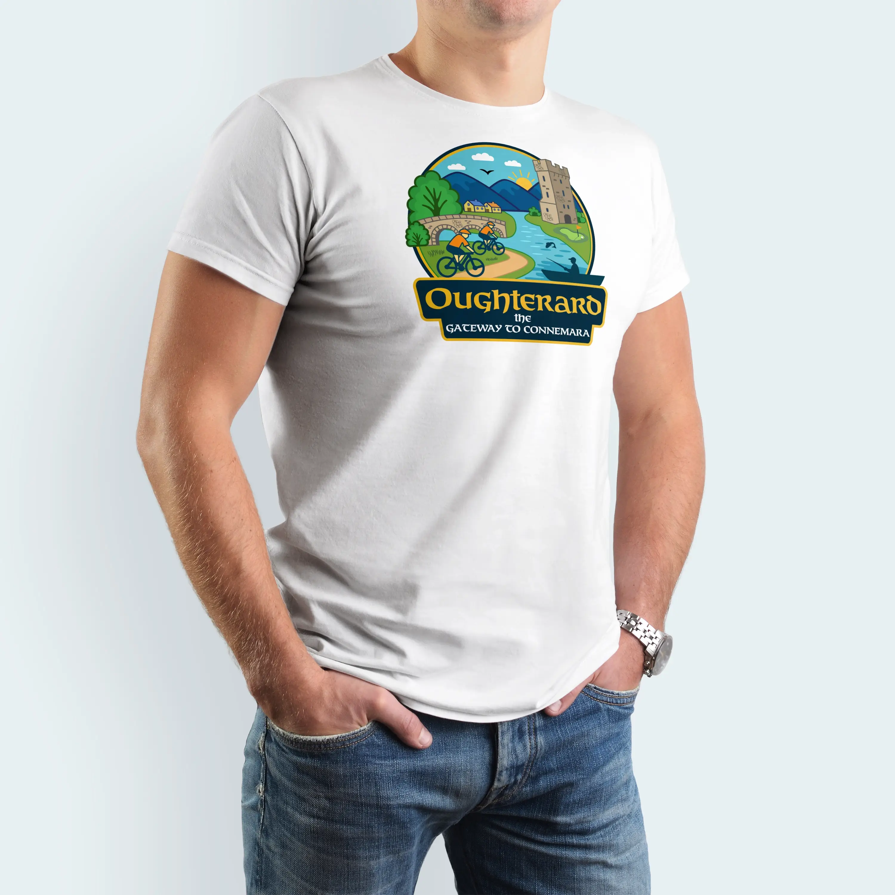
Whether it’s applied to a visitor map or printed on promotional t-shirts, this logo holds up and communicates exactly what it’s meant to.
Local Branding with Real Impact
Many rural towns in Ireland are now recognising the power of professional branding. Done right, town logo design offers tangible value:
- Builds recognition in tourism marketing
- Creates consistency across council and community projects
- Helps secure funding by looking professional and prepared
- Unites local businesses, events, and initiatives under one visual identity
Our job as logo designers in Galway is to make that happen — not with vague ideas, but with targeted, scalable, and honest design work.
Results: What We Delivered
- Final logo approved and supplied in multiple formats
- Brand guidelines included for consistent use
- Fast turnaround — completed in under two weeks
- Already used in print materials and on social platforms
- Positive feedback from local residents and visitors
This is exactly what a well-executed logo design Galway project should do — deliver value, clarity, and confidence in the brand.
FAQs: Town Logo Design and Community Branding in Galway
How long does a logo design project take?
Most town or community logos take between 2–4 weeks. For this project, we completed it in just under two weeks — thanks to clear feedback and a focused brief.
What does a typical town logo package include?
Our logo design Galway packages include:
- Research and discovery
- Multiple concepts to choose from
- Revisions based on feedback
- Final logo in vector, PNG, JPEG, and social formats
- A basic brand guide for colours, fonts, and application
Can you provide signage and brochures too?
Yes. We frequently support towns with full visual systems — from roadside signs to visitor brochures and wayfinding maps — all aligned to the logo we design.
Why choose Designwest for logo design in Galway?
We’re based in the west of Ireland and have delivered branding projects for dozens of councils, communities, and non-profits. We understand local needs, we speak in plain terms, and we deliver work that’s built to last.
Conclusion: Community Branding That Delivers
Oughterard’s new logo is more than a design — it’s a shared symbol. It ties together the past, present, and future of the village in a way that’s clear, usable, and rooted in place.
If your community or organisation needs high-quality, strategic logo design Galway clients can trust — we’d be happy to talk.
